

CROSSER RADIO
August, 2020
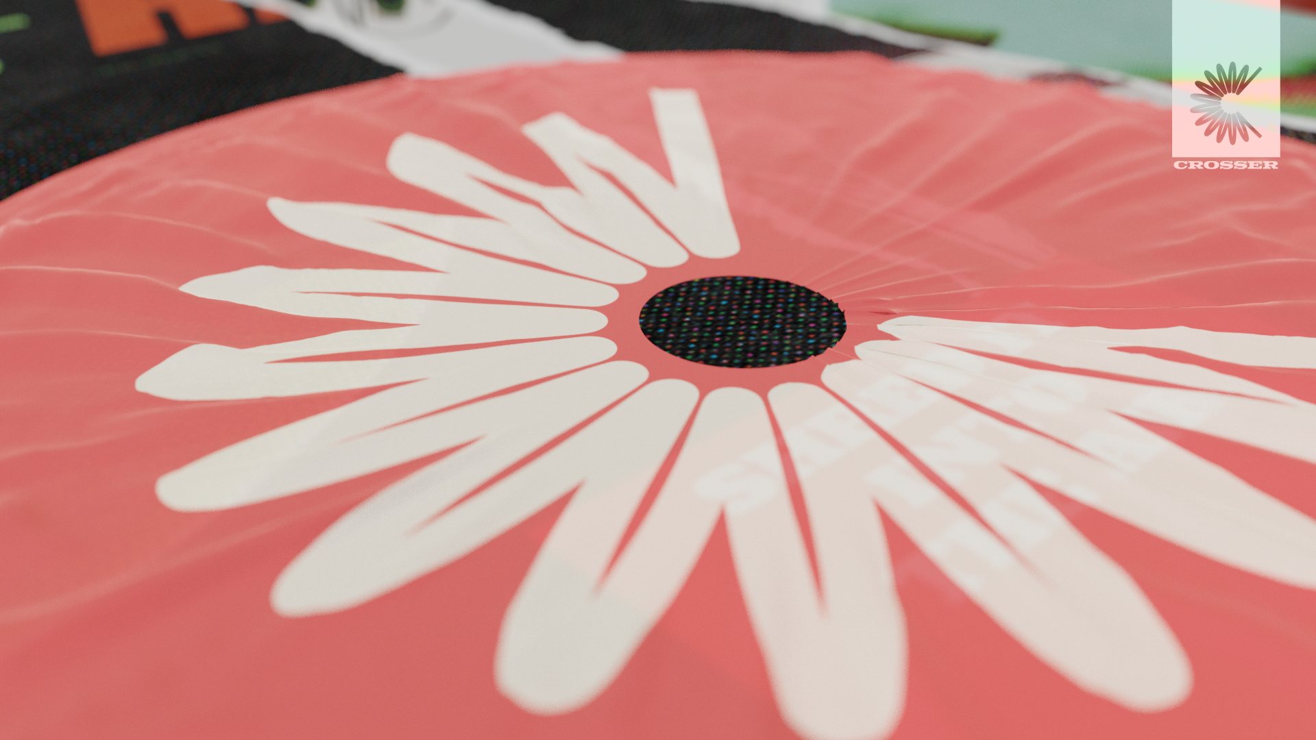
Above: Crosser MK-01 Transceiver concept, packaging & logo.
Crosser Radio is a conceptual product aimed to serve as an introduction to the world of amateur radio and as a means for people to enjoy music the company of others in lieu of festivals and cultural events during lock-down.
I wanted to make sure the visual identity was based firmly in amateur/HAM radio. The Logo is designed to resemble both a toroid choke and coiled cables - essential pieces of kit for amateur/HAM radio - while also adopting a C letterform.
A minimalist, mid-century inspired packaging design keeps the packaging looking slick and seamless. It also provides the opportunity for campaign imagery to be easily incorporated into the design without compromising cohesive branding or visual harmony.
COLOUR STORY
August, 2020
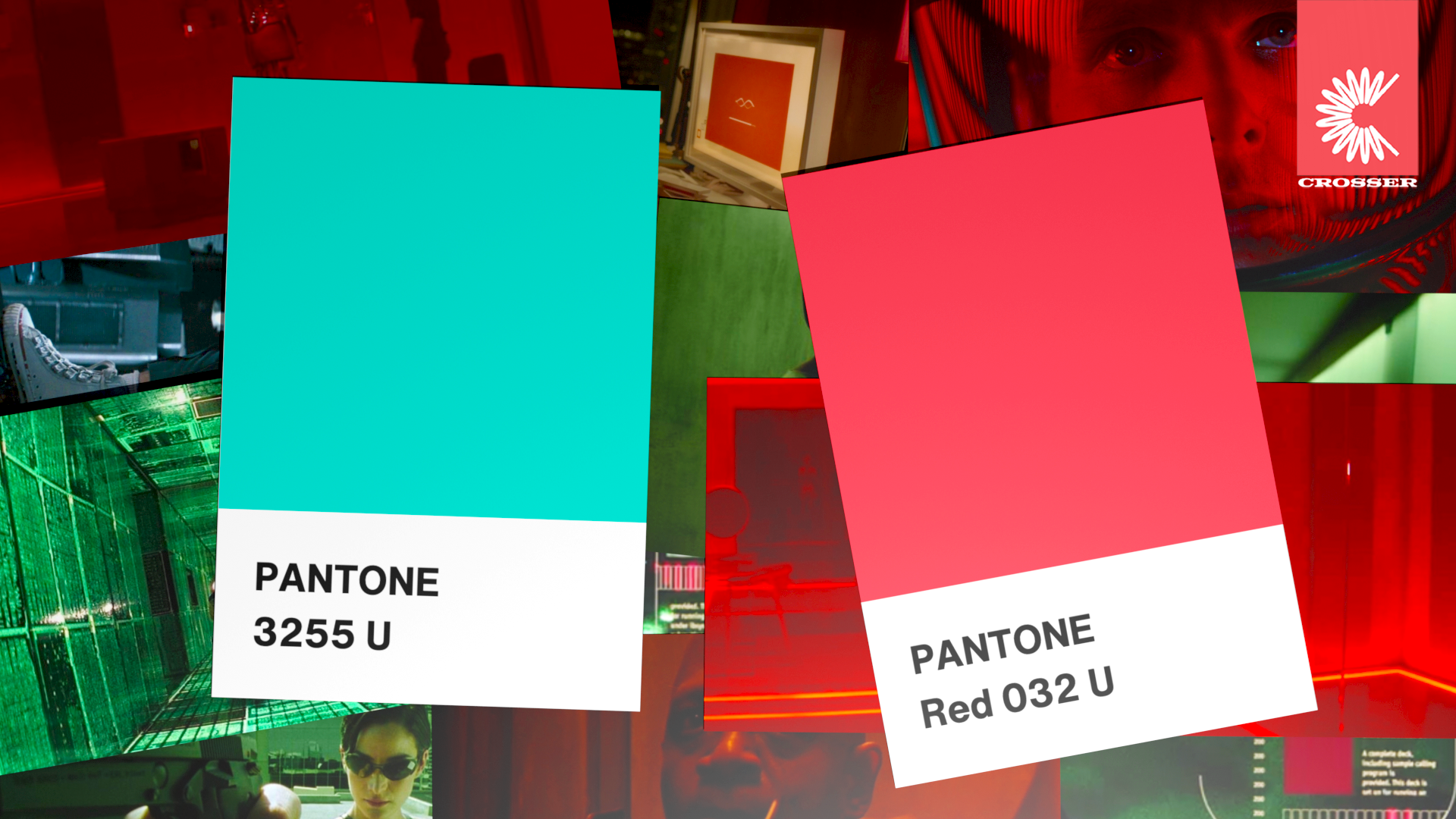
Above: Pantone Red 032 U & Pantone 3255 U.
Intrigued by the potential in the use of sci-fi imagery I wanted the colour scheme to heavily pay homage to the typical conventions of the genre. Through my research I found that red and green tones were used heavily, perhaps due to their utilitarian potential in communicating visually.
After much testing, I settled for brighter pastel hues to tie in the mid-century modern inspired aesthetic I was also hoping to achieve.
‘SHRED IT INTO THE AIR’ TEASER CAMPAIGN

August, 2020
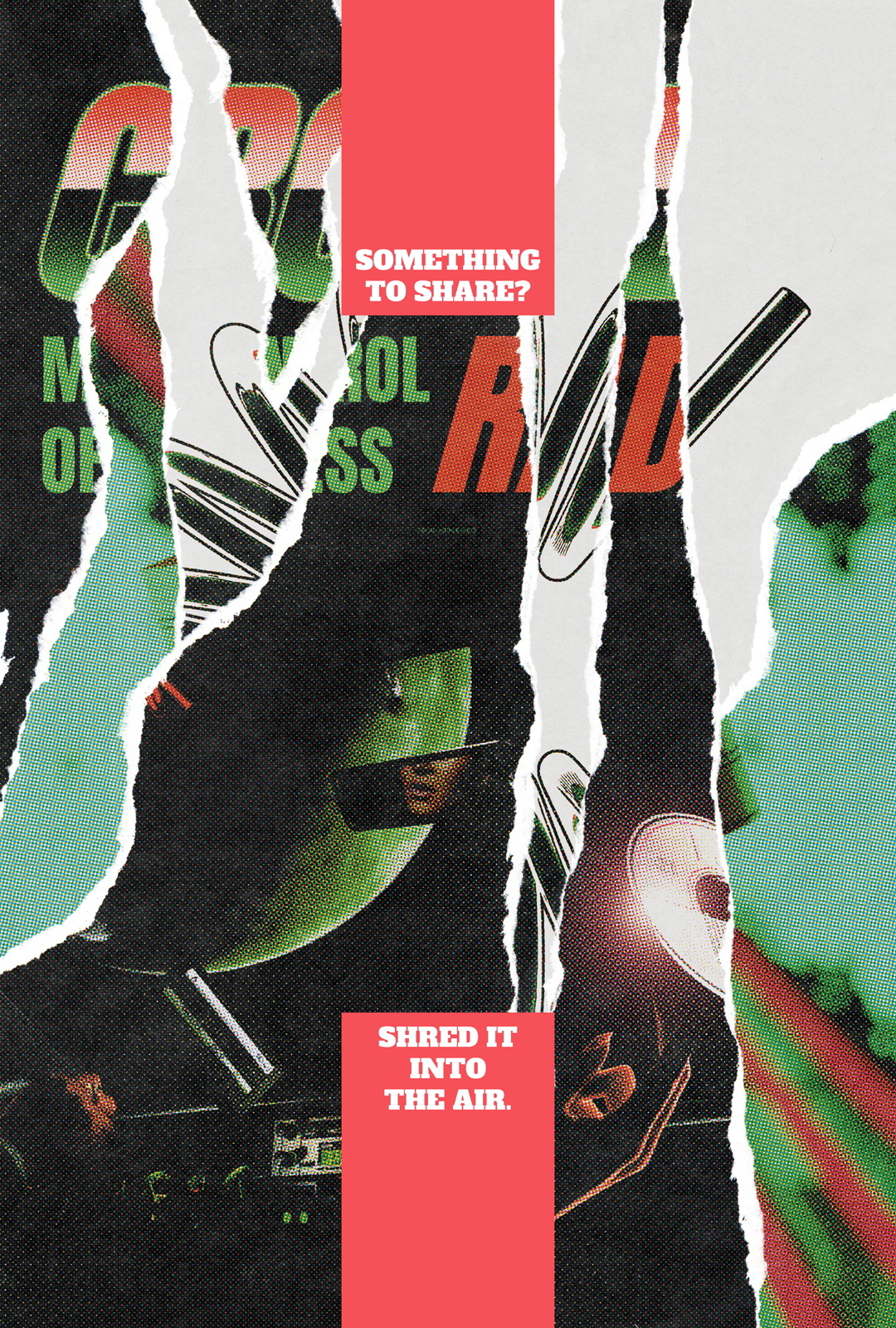
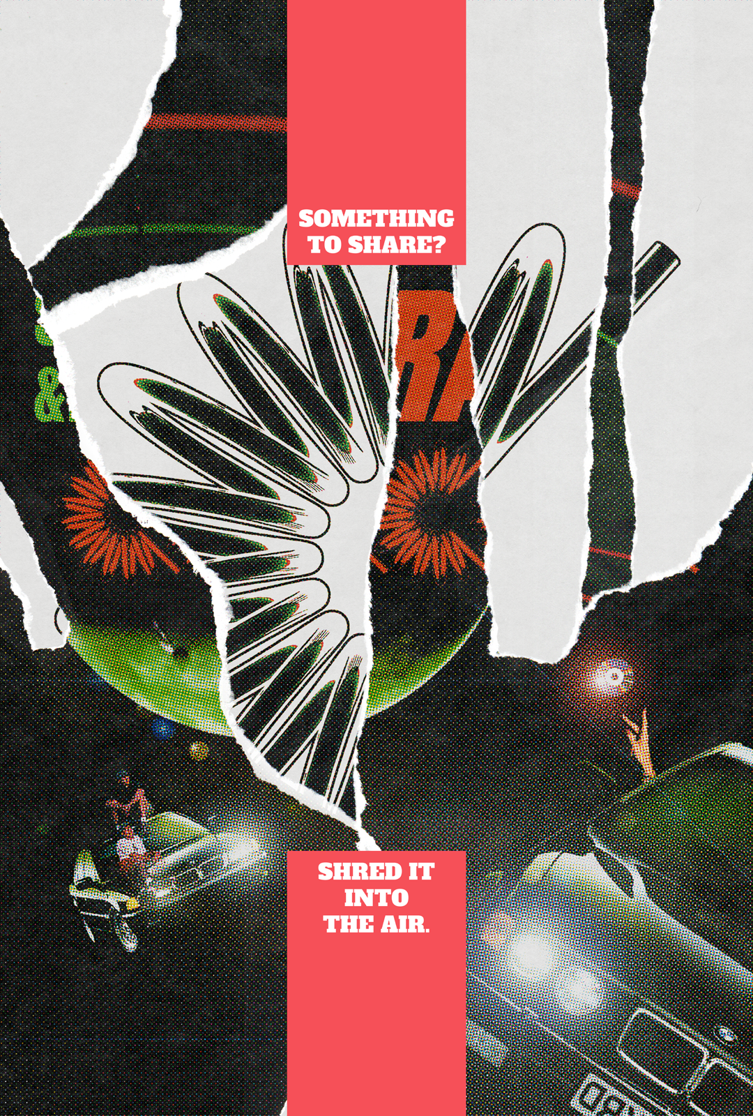
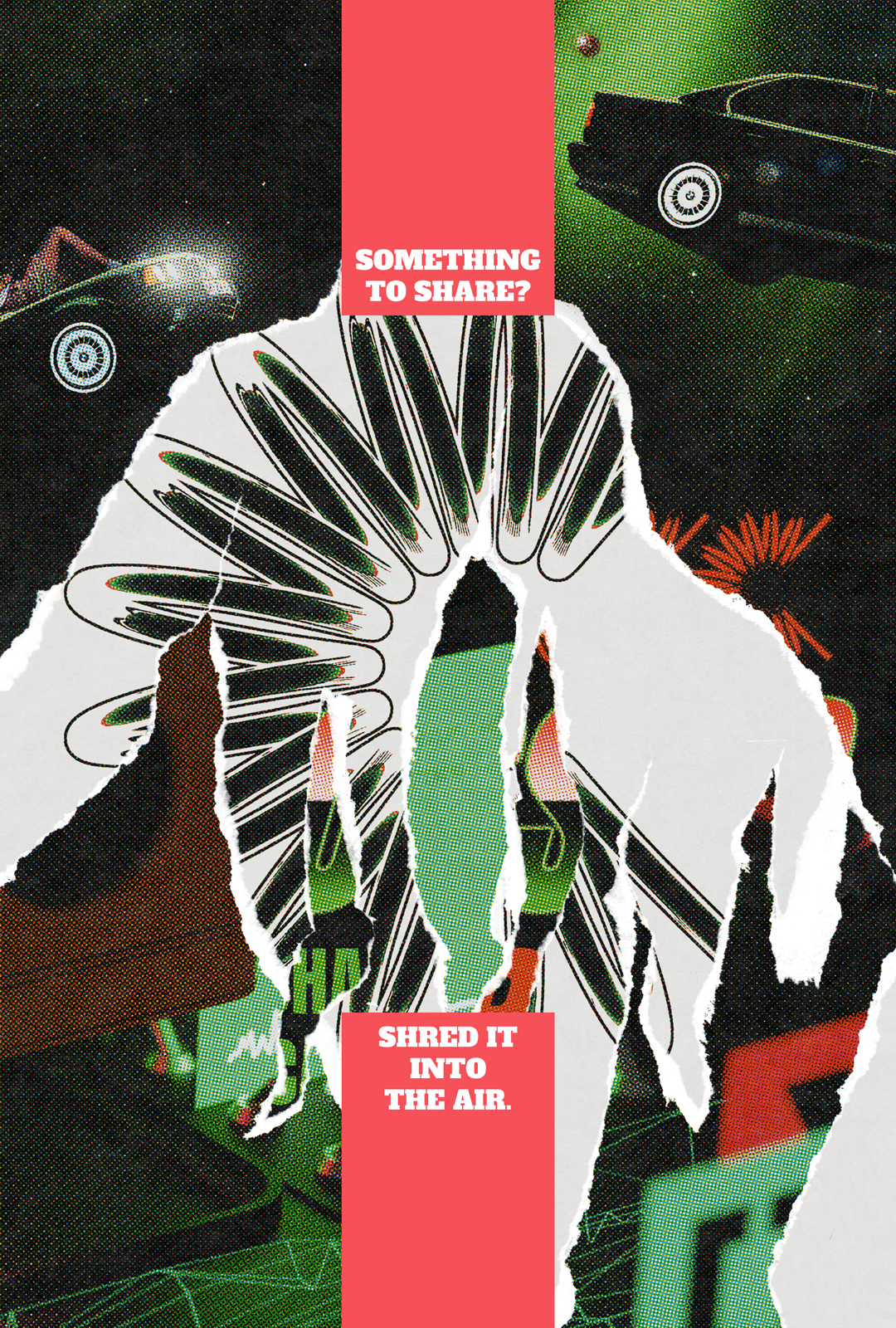
Above: four-part sequential teaser poster series.
Teaser campaign inspired by the colloquial musical term “shredding” and the counter-cultural, D.I.Y. origins of amateur/HAM radio. I deliberately designed the posters to be very esoteric and enigmatic to capture this, honing in on the motif of torn or peeling paste-ups that alludes to street culture and music venues, along with clever copy-writing referencing the FM airways.
The imagery conveys the visual metaphor of being adrift in a car in space with nothing to do but listen to FM radio. I felt this imagery, using conventions of Surrealism, Sci-Fi and rave culture, captures the isolation and boredom some would feel during lock-down and how it may be supplemented with music. The series of posters are sequential with the imagery conveying a narrative of music sharing.
CARE PACKAGE
August, 2020
Above: Crosser MK-01 packaging & parachute concept.
With the product conceived as a means of mitigating pandemic-induced isolation, I really liked the idea of the packaging and delivery mode of the Crosser MK-01 being inspired by care packages. Even if the package hasn’t literally been dropped from the sky, the idea of it being left on the doorstep with a small parachute as if it has, is, I feel, a nice touch.
‘SHARE THE AIR AND DON’T SPARE’ CAMPAIGN
August, 2020
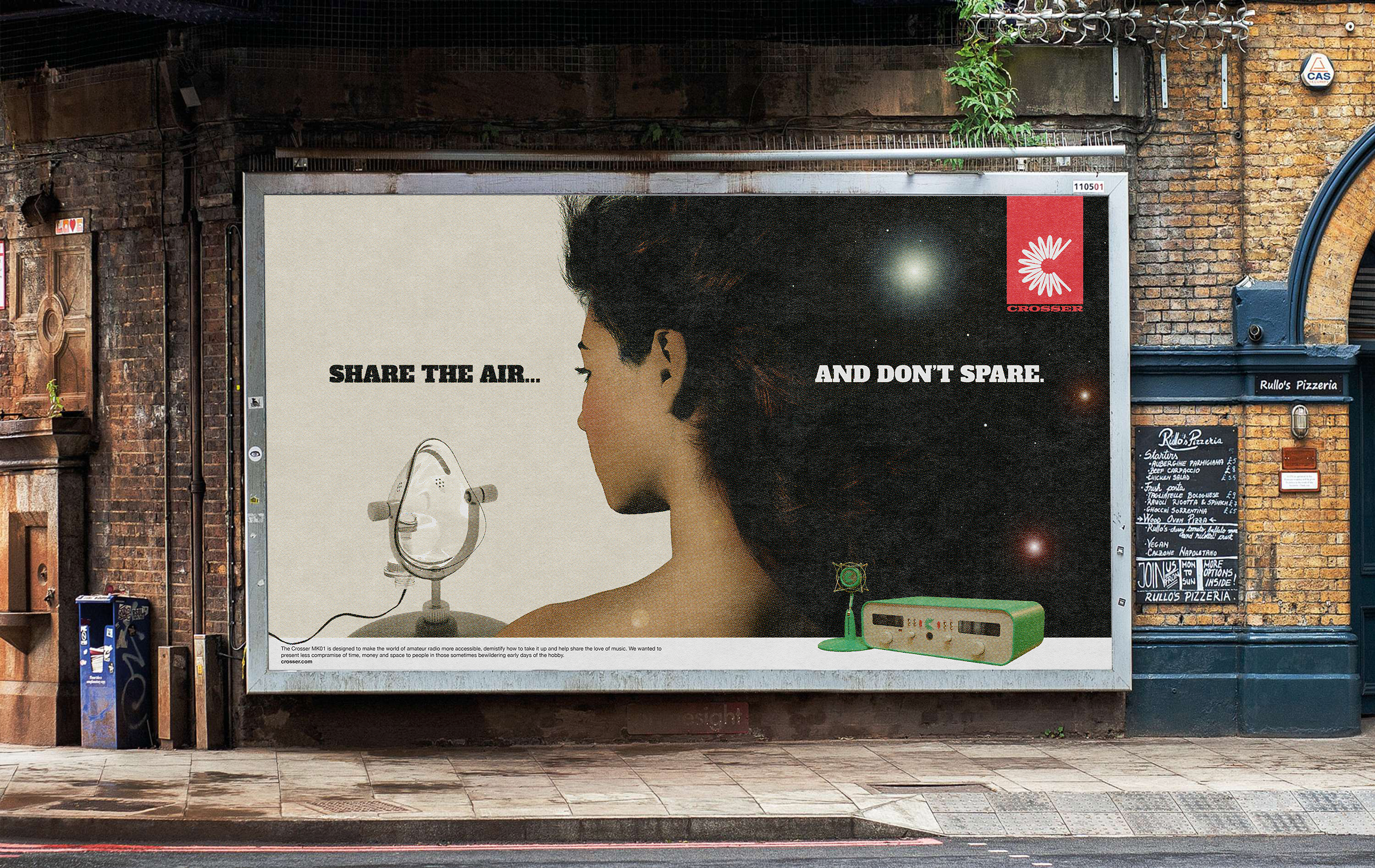
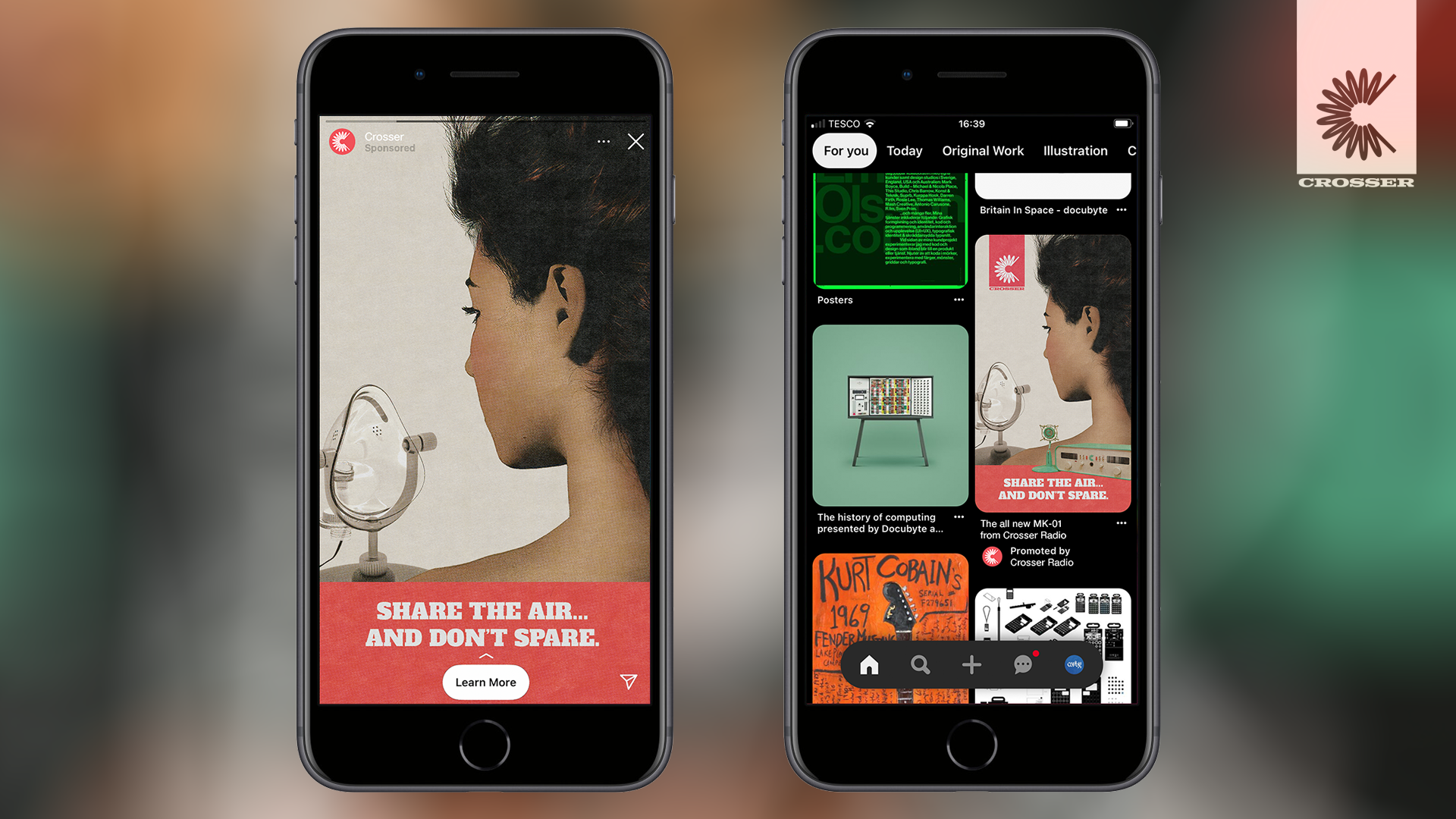
Above: ‘Share the Air...’ billboard and targeted online ads in-situ.
‘Share the Air and Don’t Spare’ campaign concept making use of aforementioned copy-writing referencing the FM airways or the concept of being “on the air”. The Air presents opportunity for a through-line for all the Crosser Radio marketing collateral and as a name for the Crosser Radio usership.
EXPOSURE
August, 2020
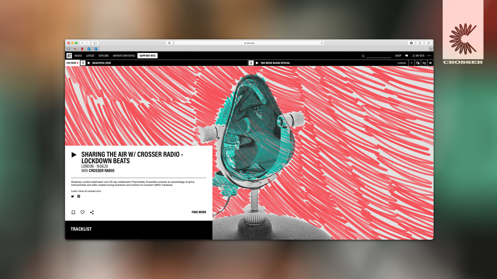
Above: NTS show promoting the music shared over the airways via Crosser users, helping expose underground music fans to Crosser Radio.
Above: NTS show promoting the music shared over the airways via Crosser users, helping expose underground music fans to Crosser Radio.
MERCHANDISING
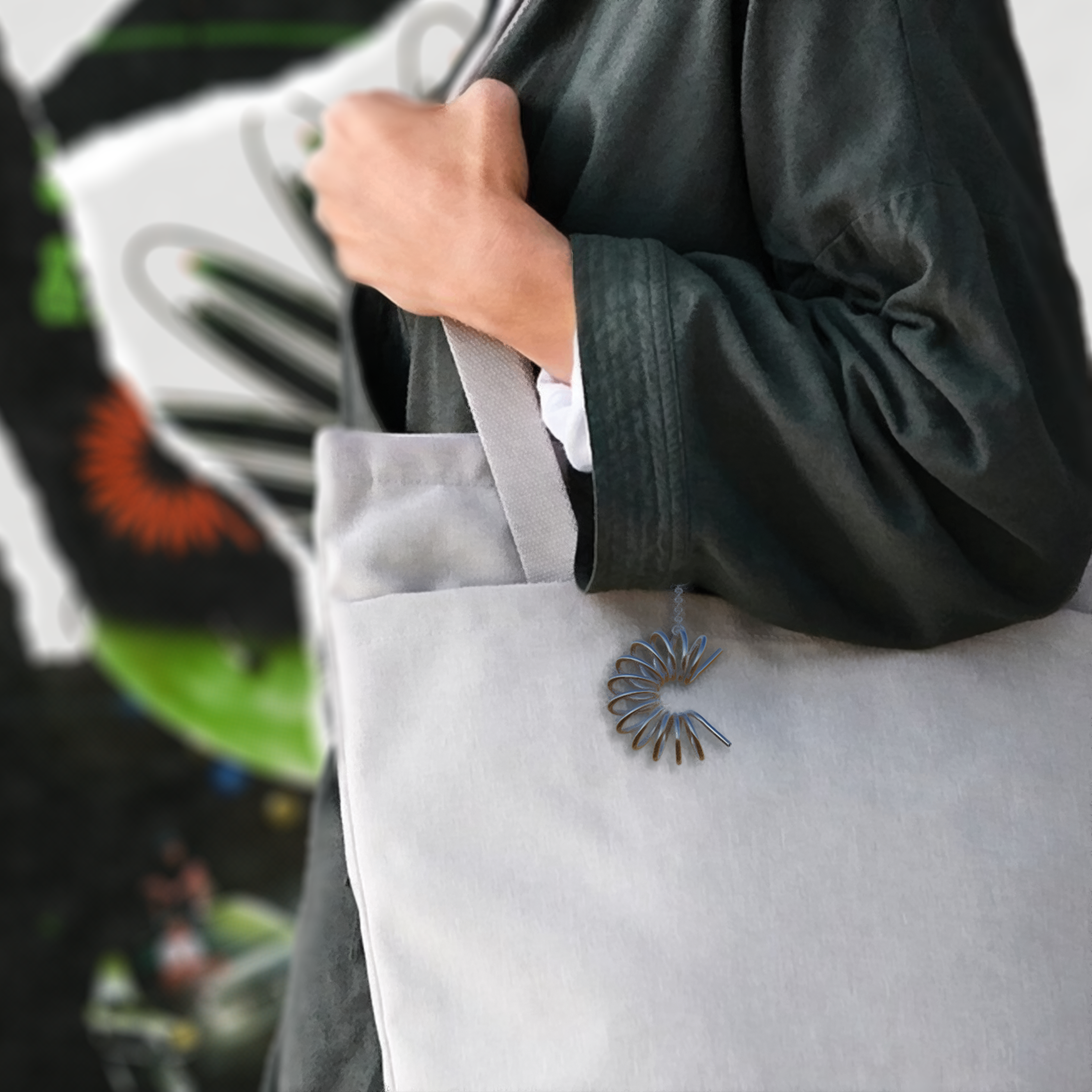

August, 2020
Above: Merch mock-ups.
Above: Merch mock-ups.
DEVELOPMENT DOCUMENT
August, 2020
Above: Orignial research and development document showcasing original research and early drafts of the project.
Above: Orignial research and development document showcasing original research and early drafts of the project.